About the Data
Project Goal
My objective here is to utilise most Power BI features which I had learned using different online courses. I am curious about curating data and analysis. Such mini projects (self-made) allow me to think and progress. As part of my job I do regular data analysis and visualization, however I felt this isn't enough to showcase my talent. Hence I utilised an open-source platform to collect raw data to analyse and build a dashboard.
This dashboard is built around four core questions:
Results
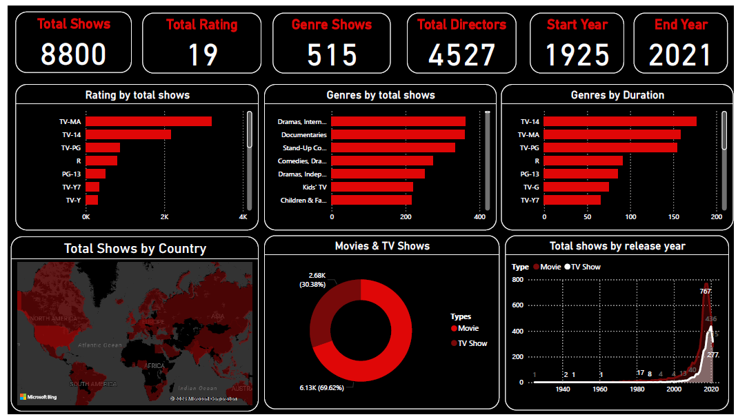
This dashboard provides a comprehensive analysis of a Netflix dataset, covering key metrics and trends related to shows and movies. The design is clean, with a dark theme and prominent visuals that make the data easy to interpret.
Key Performance Indicators
The top row of the dashboard presents high-level summary statistics, providing an immediate overview of the entire dataset.
Visualizations — Middle Row
Three bar charts that break down the data by key categories.
Rating by Total Shows
A horizontal bar chart showing distribution by maturity rating. TV-MA leads, followed by TV-14 and TV-PG — indicating that a significant portion of the Netflix library is geared toward mature audiences.
Genres by Total Shows
Dramas & International Movies is the leading genre, followed by Documentaries and Stand-Up Comedy — reflecting a strong presence of non-fiction and comedic content on the platform.
Genres by Duration
Total duration per rating category — offering another view of content volume distribution that goes beyond simple title count.
Visualizations — Bottom Row
Geographical distribution and time-series analysis providing deeper context.
Total Shows by Country
A world map with darker red shading for higher content concentration. USA and India lead — reflecting Netflix's key markets and largest content libraries.
Movies vs. TV Shows
Donut chart breakdown: 6.13K Movies (69.62%) vs. 2.68K TV Shows (30.38%). Netflix's library is firmly film-dominant.
Total Shows by Release Year
Line chart from 1940–2020 showing slow growth until the 2000s, then explosive acceleration — peaking in 2018 with 767 releases, reflecting Netflix's aggressive content strategy.